
What to wear for family photos
Portrait Session
All content, including images and text, is the exclusive intellectual property of Laura Priestley Photography. All rights reserved.
Planning Your
consider your season
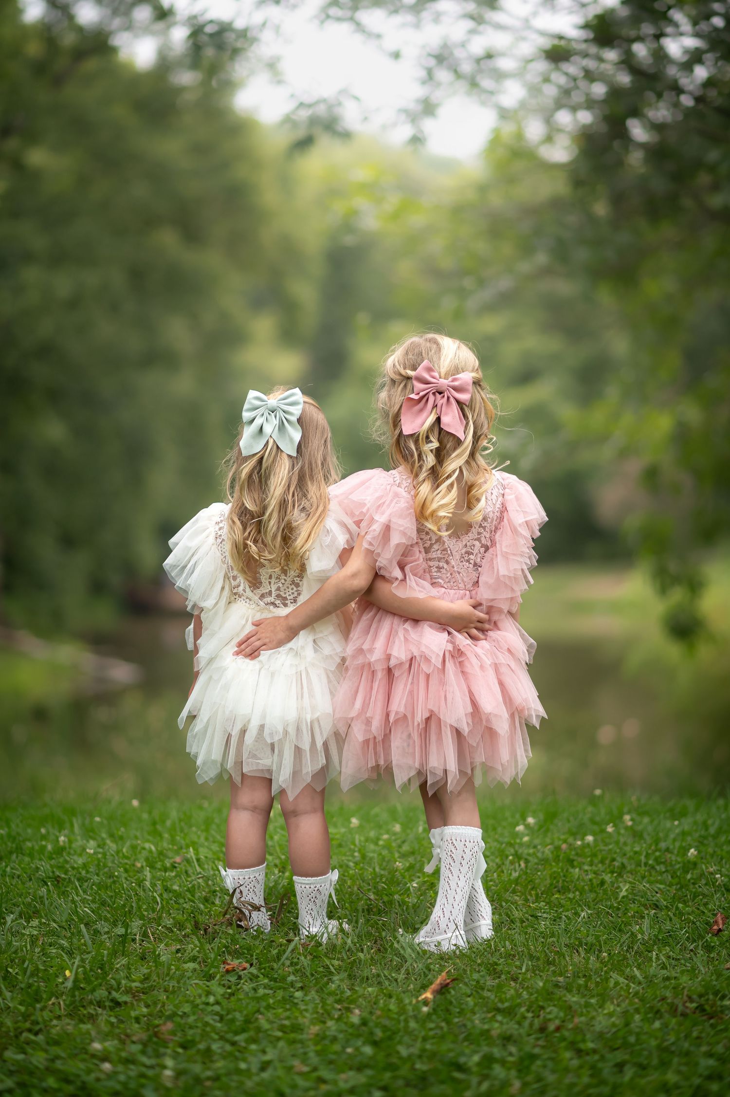
Scroll down to read all, or
click for wardrobe tips for each season:
consider your location
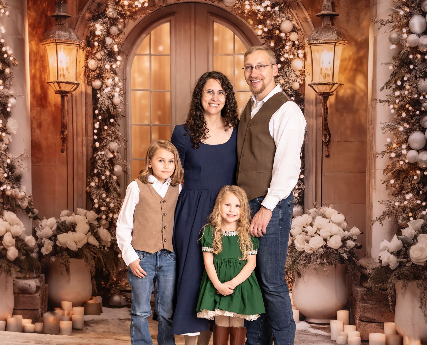
Scroll down to read all, or
click for wardrobe tips by location:
In-home
consider your group size
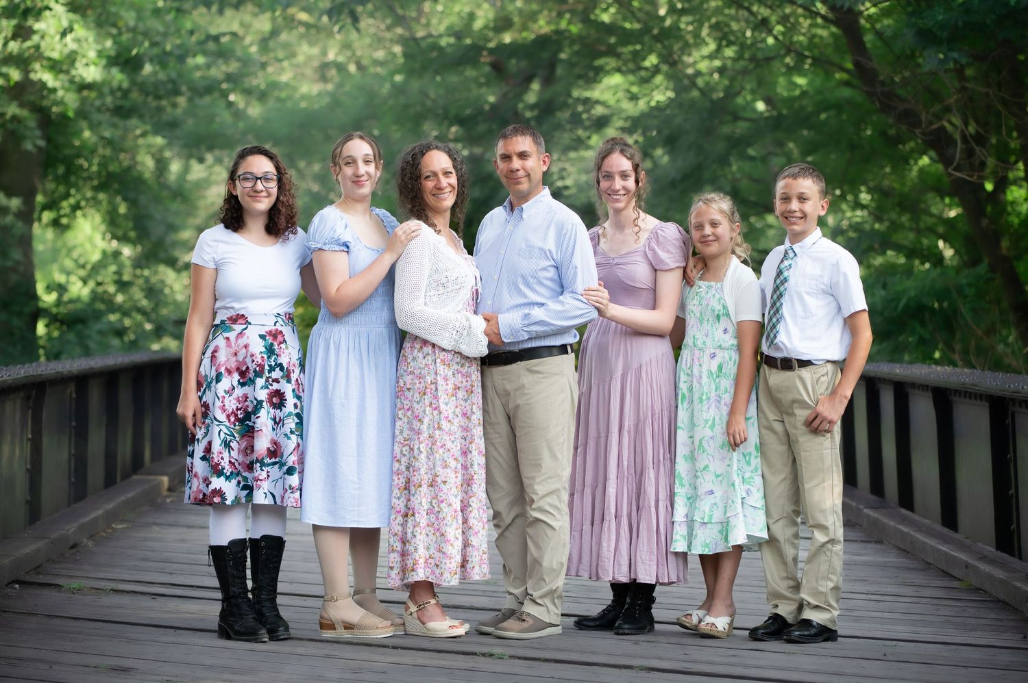
Scroll down to read all, or click below to navigate to
wardrobe tips for various group sizes:
general tips – what to avoid
n. 1
Avoid loud patterns,
and too many patterns.
Opt to mix one subtle plaid shirt and one muted floral dress with several solid pieces, for example, instead of putting everyone in plaid.
n. 2
Avoid logos and graphics.
Logos and graphics are distracting and discordant in most settings.
The notable exception would be for styled urban shoot downtown, where the session is geared around the clothing.
N. 3
Avoid bright and neon colors for groups sessions.
These are challenging to coordinate attractively among multiple people, and typically clash with the background.
n. 4
Avoid combining
black & white.
Black and white clothing can be beautiful in portraits, but the session needs to be carefully designed to accommodate that combination. For a typical outdoor group session, avoid wearing both together.
coordinating for
in-studio session, outdoors, or in-home?
The first factor to consider when planning your session wardrobe is the location of your session– will we be shooting indoors, in a controlled studio environment, outdoors on location, or in the comfort of your home?
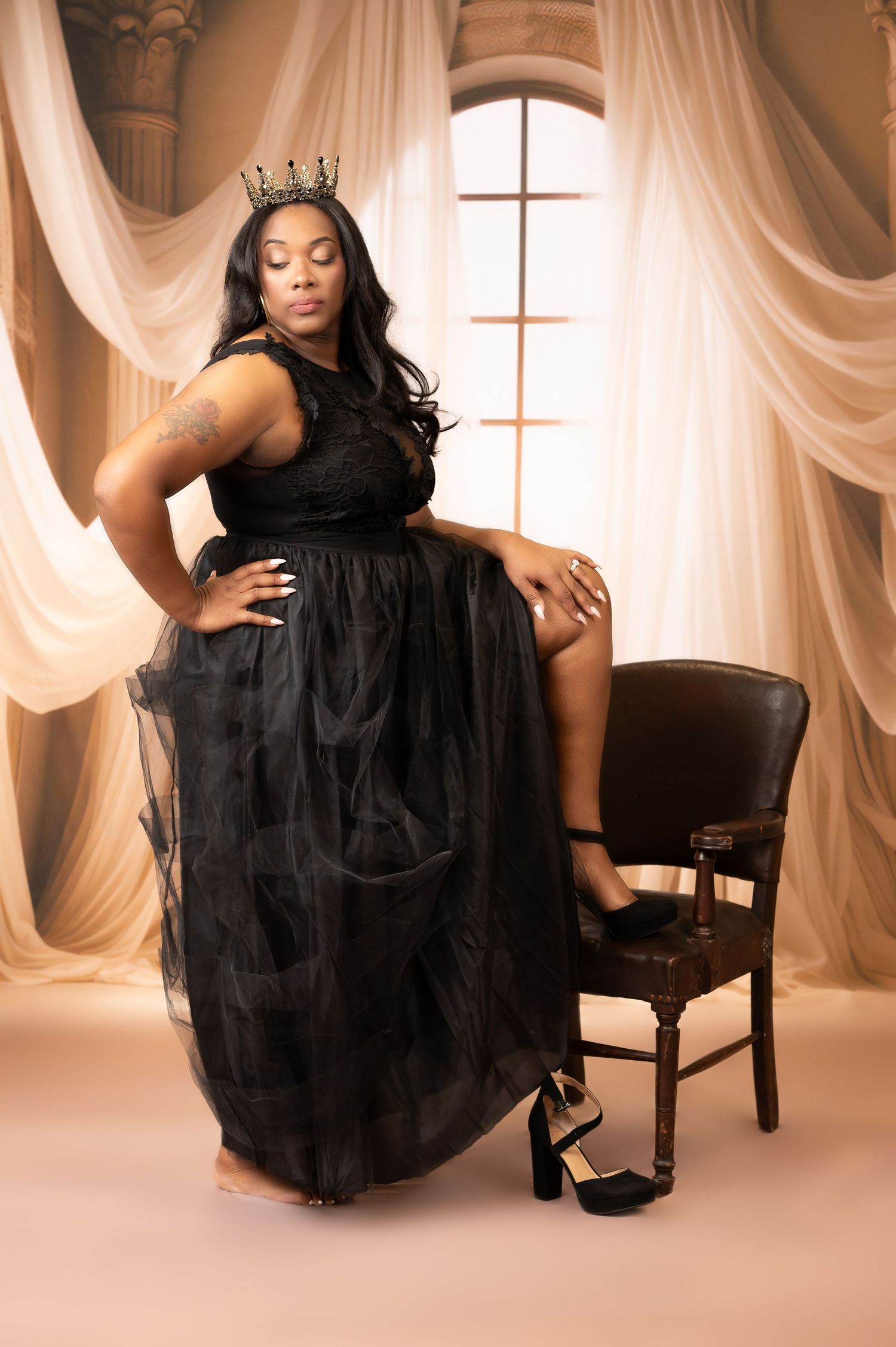
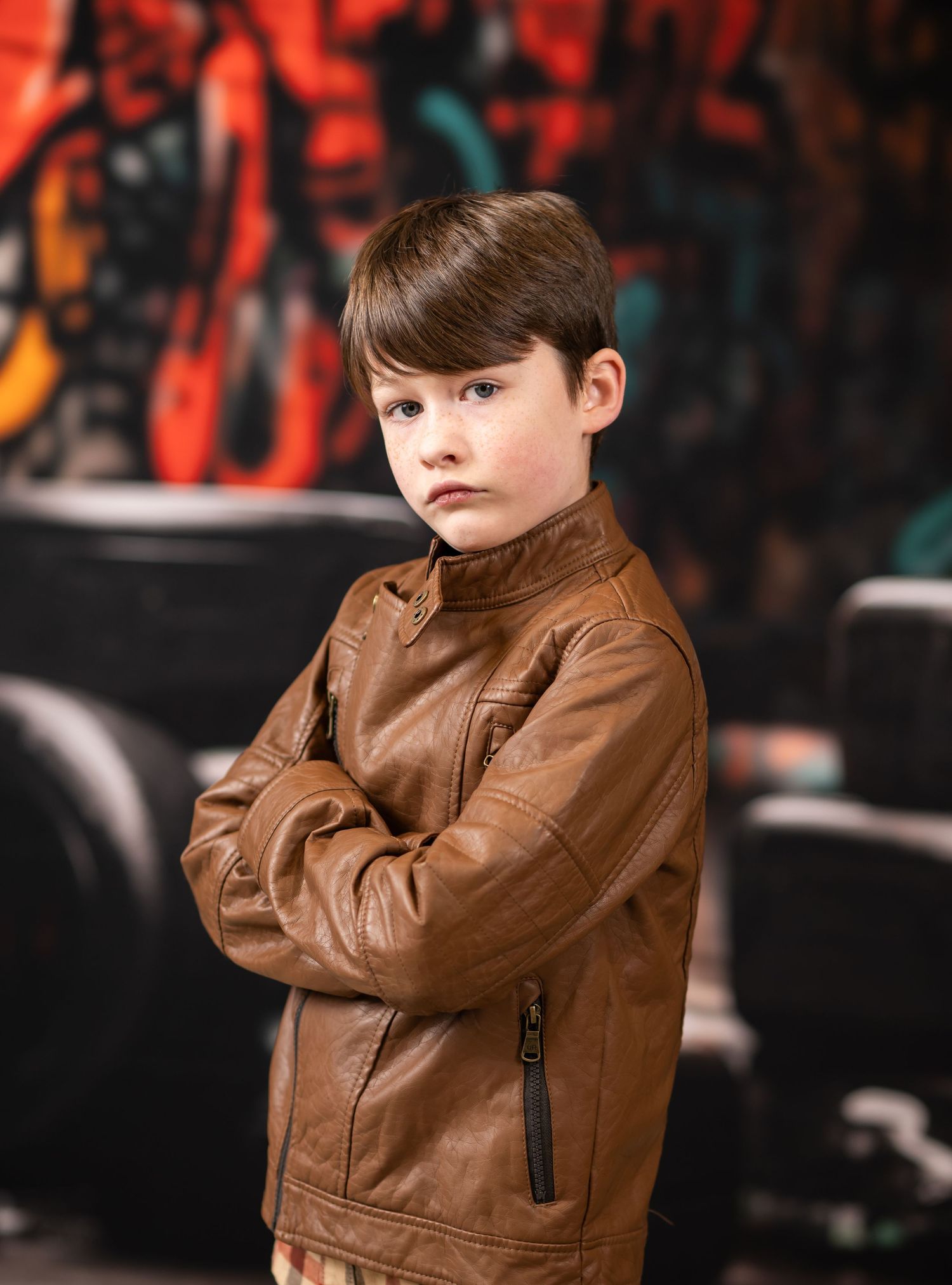
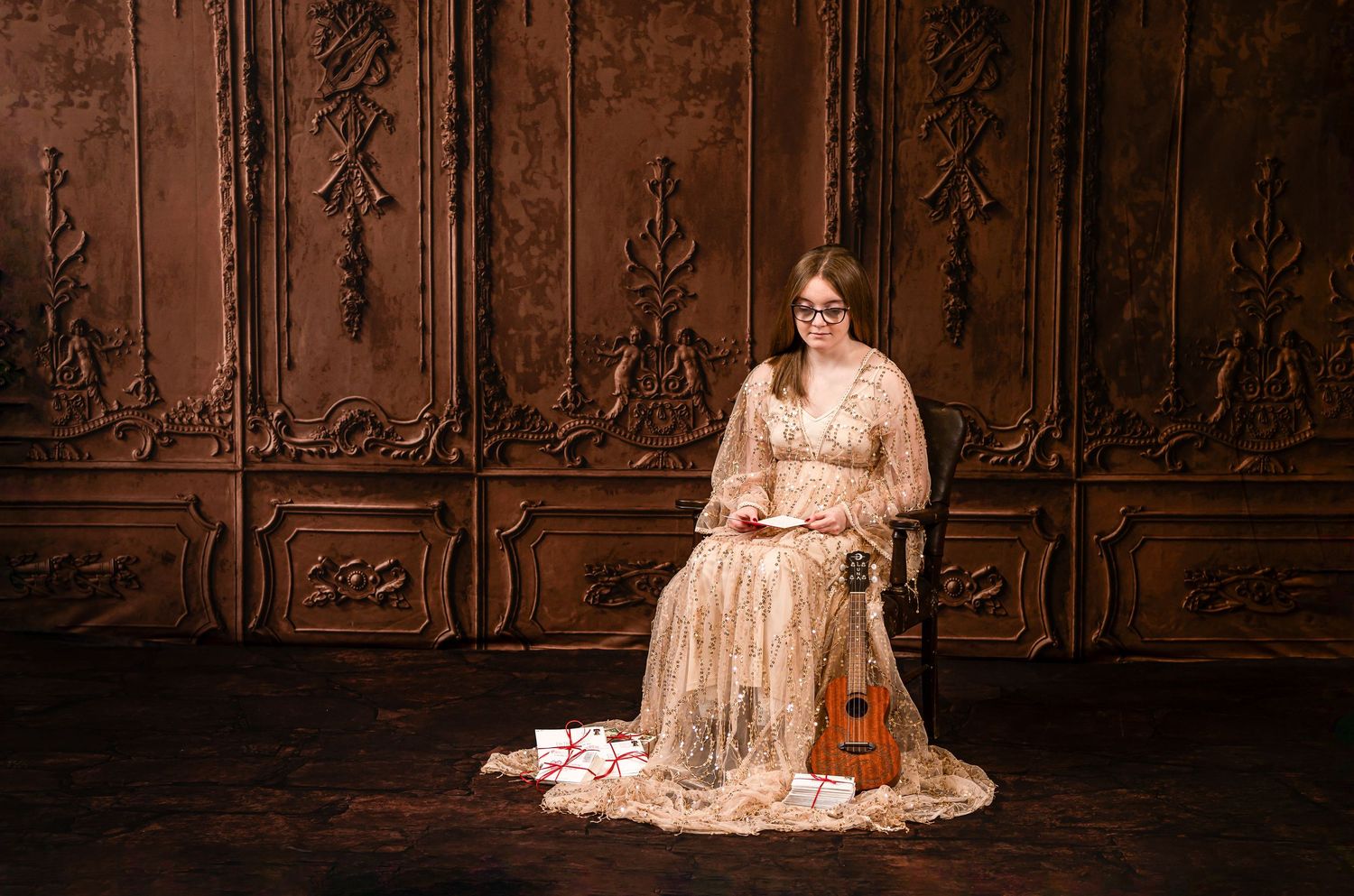
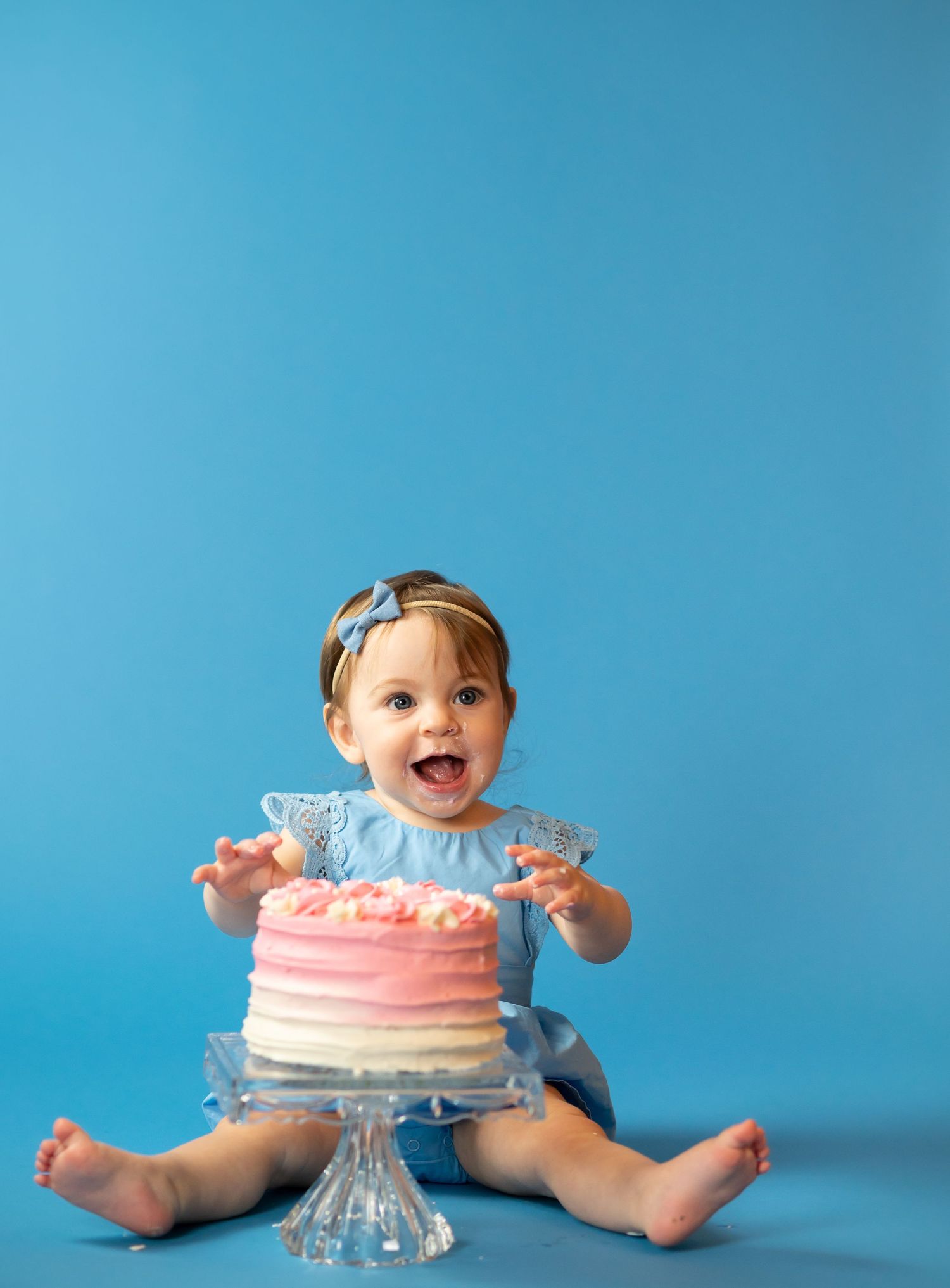
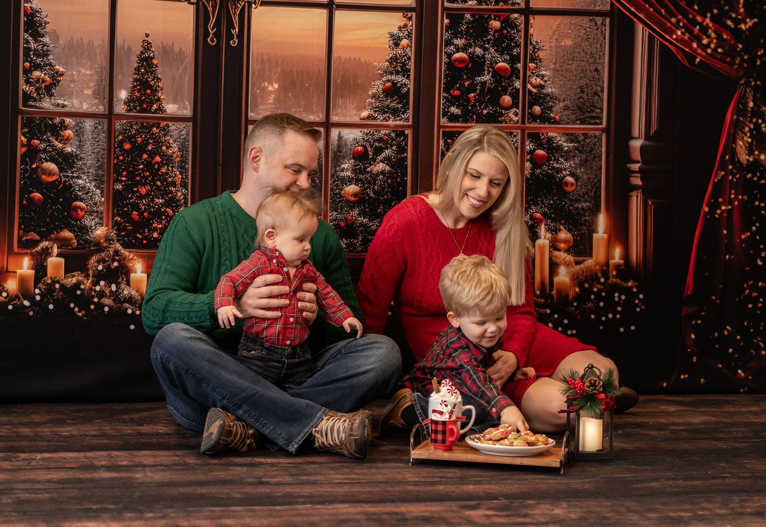
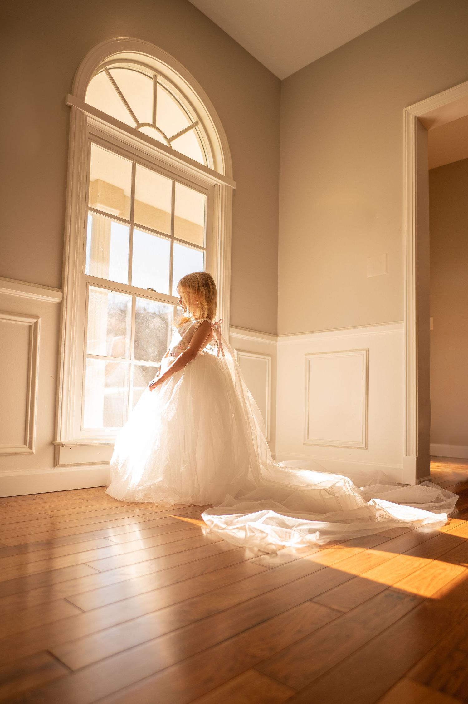
Studio sessions take place in a highly controlled environment. The background, lighting, and temperature/weather are all tailored to the needs of your photo session. Because of this, we have significantly more freedom when choosing your wardrobe for a studio photo session-- a client can wear a frilly dress in January, or a full suit in July, for example, without worrying about the weather.
We can also build your studio session around certain wardrobe choices that wouldn't mesh as well with nature in an outdoor session-- such as bright red, black, or loud, stylish avant-garde designs, for example.
For a studio session, the vision for the look and feel of the final images usually comes first, before the wardrobe choices. (Exceptions to this would be when a client has, for example, a beloved pink ballgown that they want to wear in their pictures. In this situation, the wardrobe choice would be the building block around which I would design the other elements of the studio session.)
So, wardrobe planning for a studio session usually begins with a vision & planning consultation with me first, so we can determine what is most important to you with your session, and build a plan that will achieve those results.
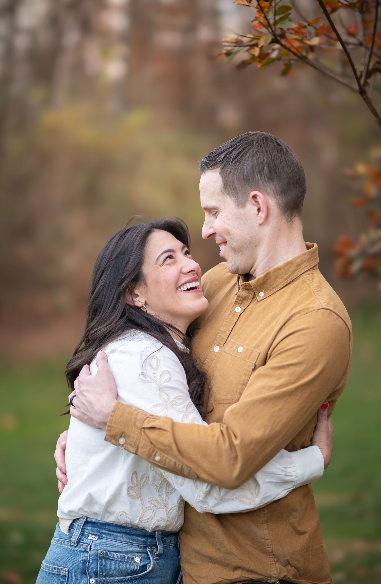
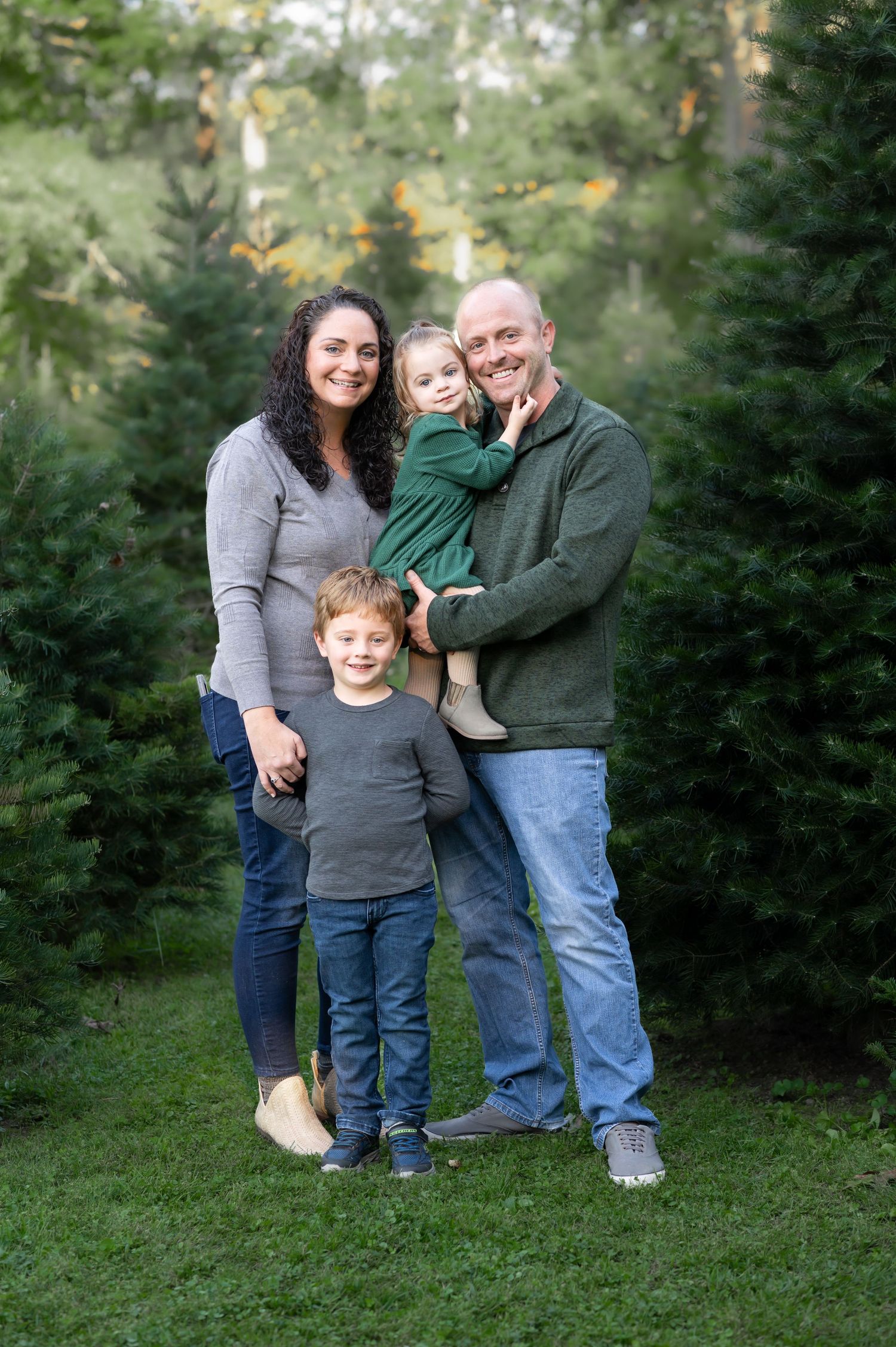
Outdoor sessions are by far the most popular choice among my clients. What an outdoor session gives up in control over all the factors of a shoot, it more than makes up for in beauty, uniqueness and the authenticity of the portrait. In my experience, the beauty of natural outdoor light simply has no equal!
Because the look and feel of outdoor images can vary so wildly depending on the factors in play, I always recommend building wardrobe choices for outdoor shoots around two things: the specific location chosen for the shoot, and the season in which your shoot is scheduled.
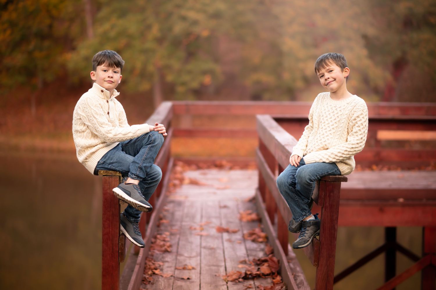
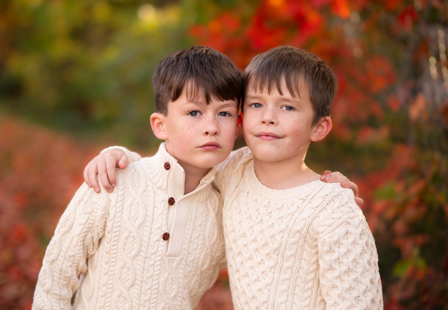
I'll cover seasons in more detail below, but for shoot location– consider the colors, tones and feel of the area selected for your session, and consider the type of images that appeal to you personally: do you like images where all the colors are of similar tone (such as the portrait of my lovely senior client shown here, where all tones in the image are soft neutrals, or like my client family at the tree farm, where all the tones are similar shades of green and gray/blue?) Or, do you prefer images that have more pop and contrast (such as the portrait of my two boys below, where their fair skin and cream sweaters pop against the rich green and red autumn foliage in the background?)
Once you know the look you prefer, then consider what your setting will look like, to choose a wardrobe palette that creates the look you like. (I'm always happy to provide samples of portraiture taken at your chosen location for visual reference, for locations I frequent. Even for an area for which I don't have sample shots, I can guide you toward choices to create the look you prefer, if you discuss those preferences with me!)
Keep scrolling to read specific recommendations for wardrobe styling based on our West Virginia seasons!
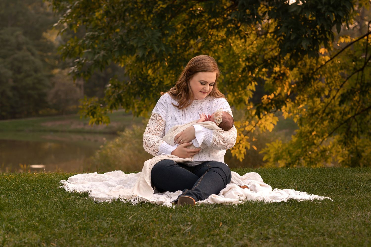
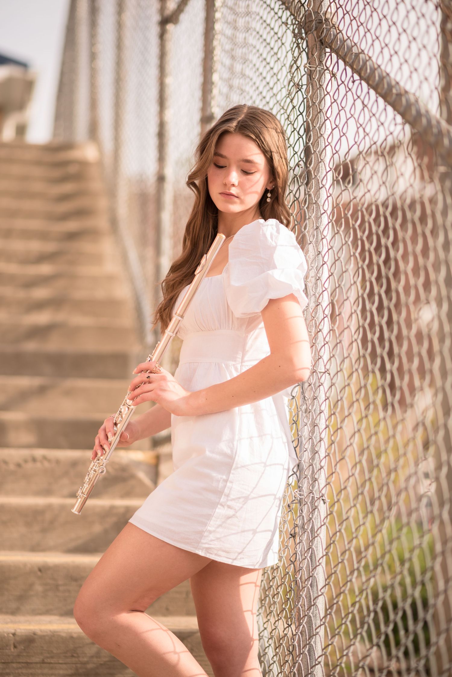

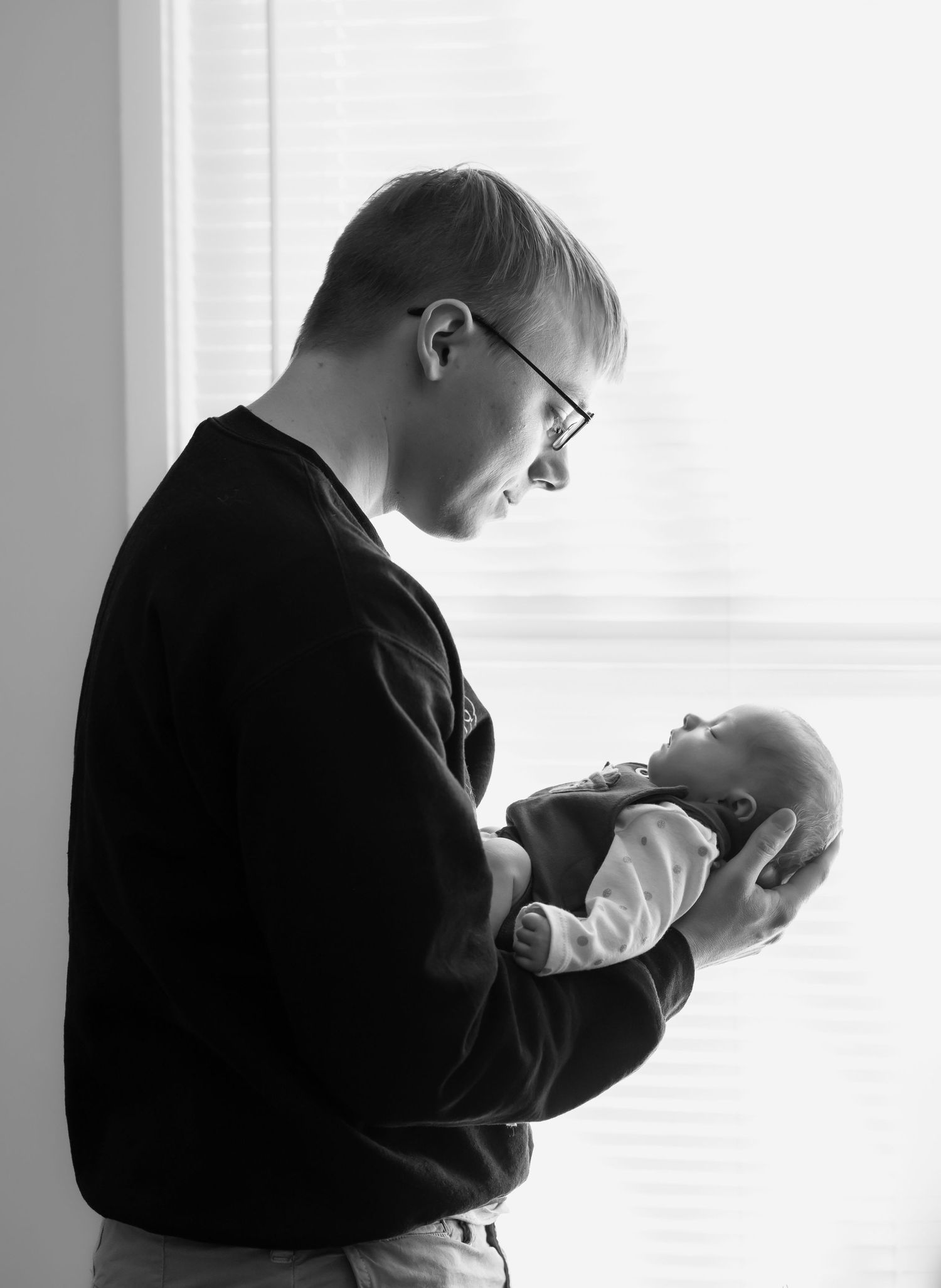
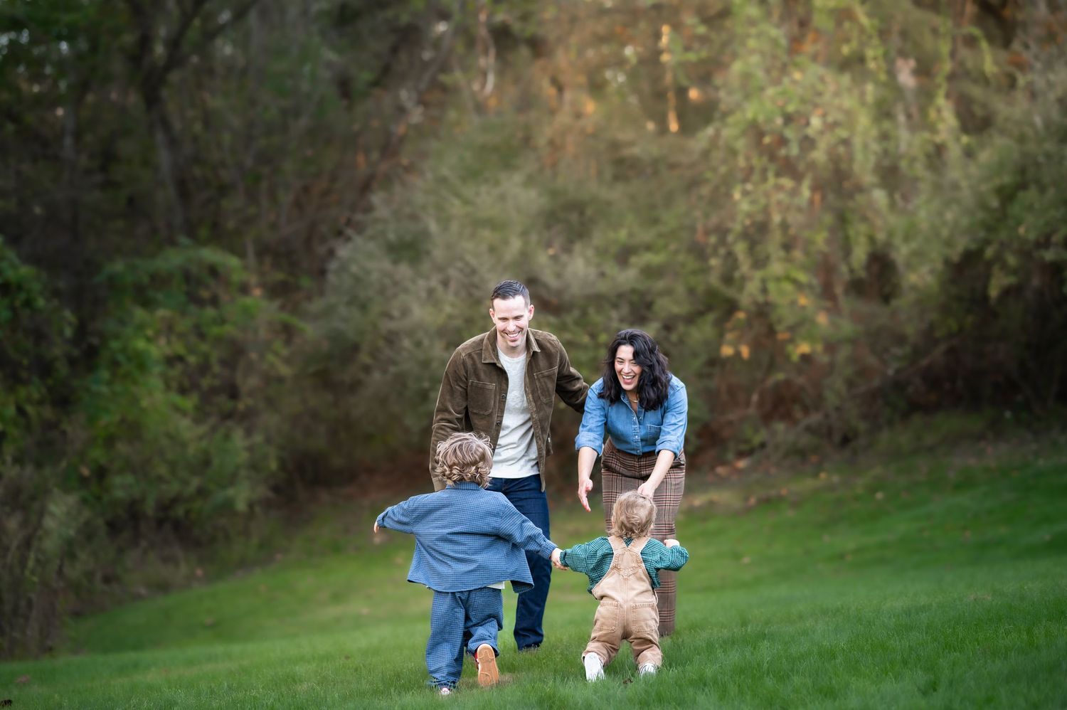
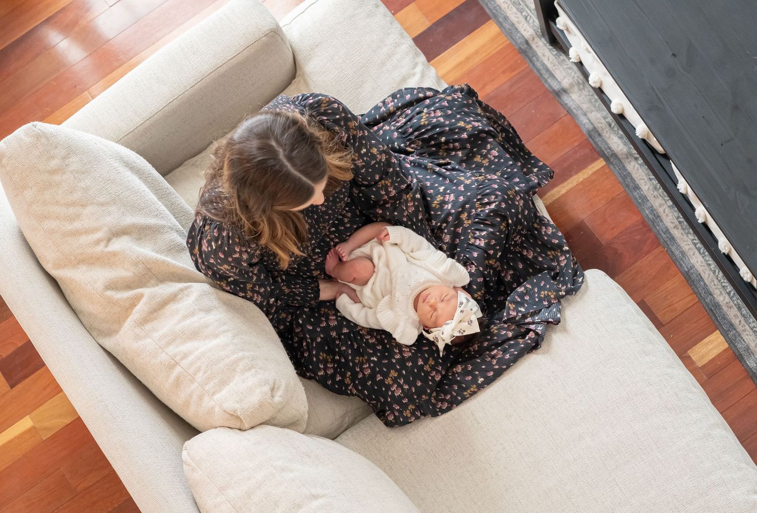
Having your portrait session in your own home can be a wonderful experience. Where better to capture timeless family memories than the place where your life together is centered, and where so many of your family's memories are already being made?
An in-home setting is also the one where your photographer has the least control over the session environment– the background, colors, and lighting in your home. Your preparation for your session can
not booked yet?
coordinating with the
West virginia's beauty is unique in every season...
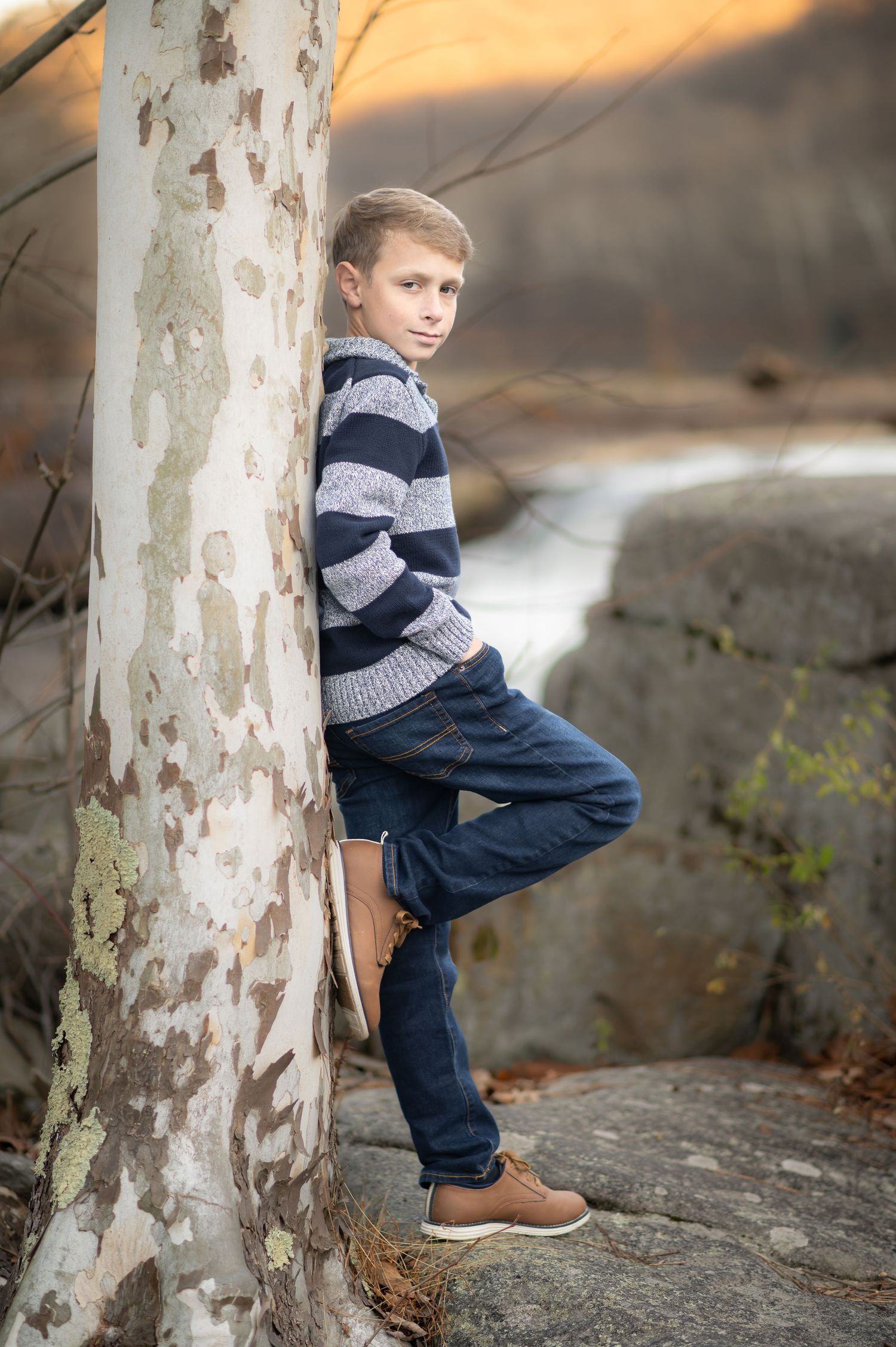
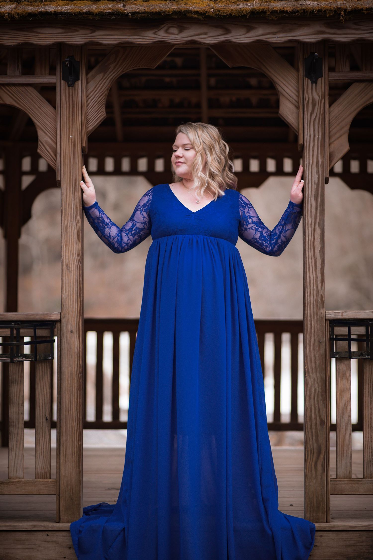
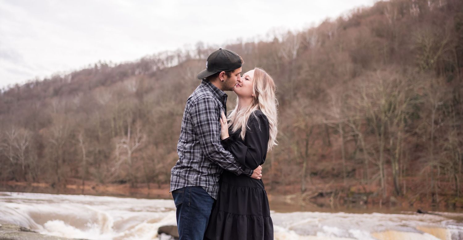
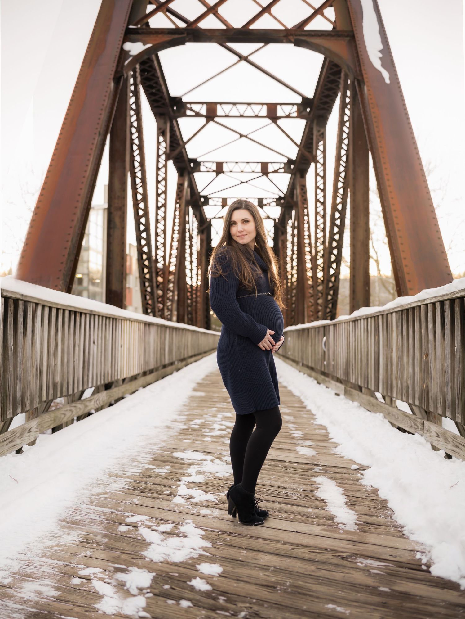
Outdoor sessions in a West Virginia winter typically feature a muted, neutral palette of grays and browns, with pale ivory skies and deep green of evergreen trees, depending on the chosen location. Because the uneven lighting associated with bare trees can make for a less appealing backdrop than when they have leaves, I often recommend urban settings such as the Waterfront or downtown Morgantown, or wilder settings with rocks, during the winter and early spring.
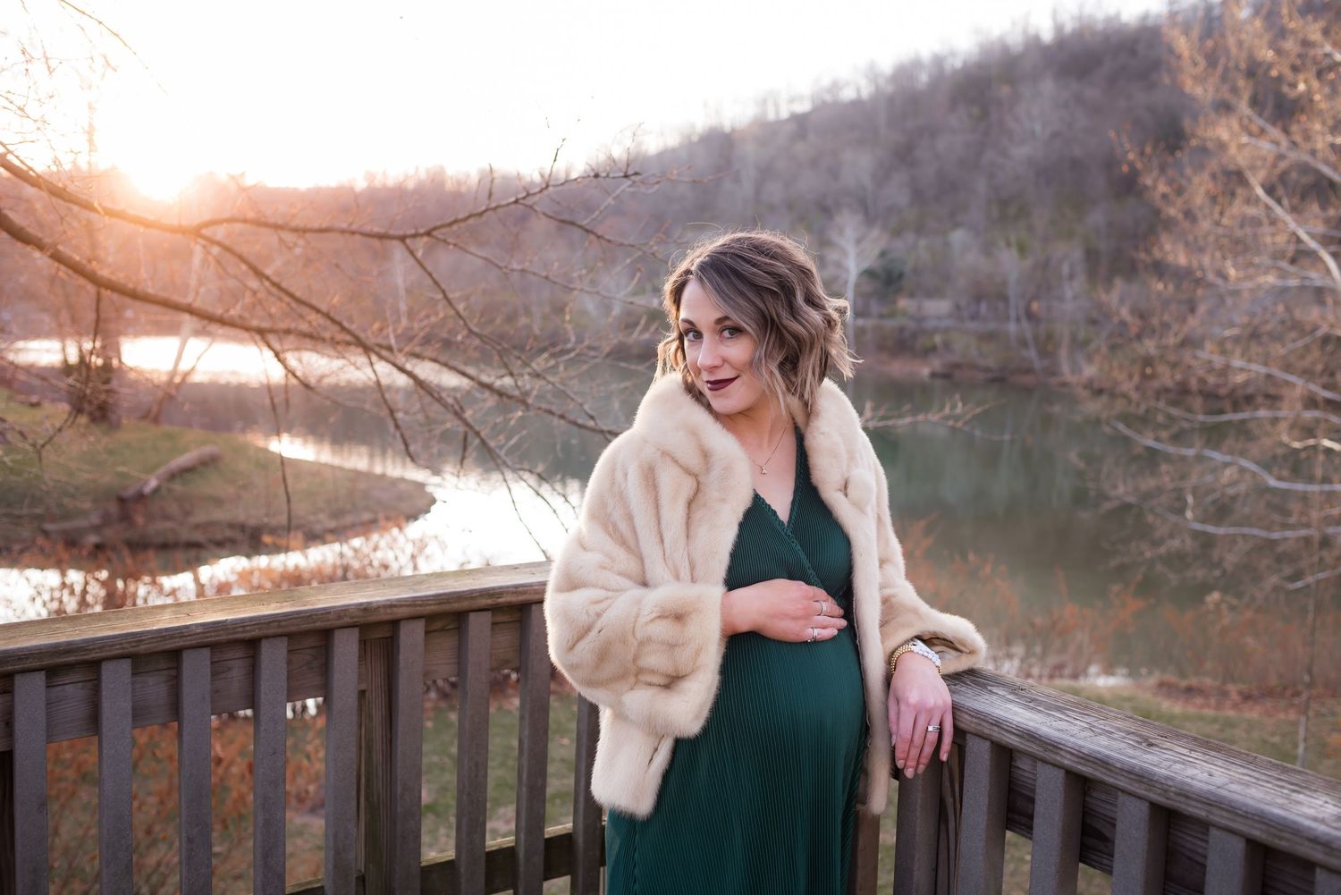
Muted neutrals and deep, rich colors work well against West Virginia's winter landscapes– and it's worth noting that black, which typically does not work well for other seasons, pops beautifully in portraits with winter scenery. Add visual interest to your images with chunky or voluminous textures (such as the fur wrap on my lovely maternity client in the green dress, or the knitted blue and gray sweater on my handsome young client, shown in these pictures.)
When coordinating a winter session wardrobe for a group, consider choosing one rich color to stick with for visual cohesion (plum, navy, or forest green, perhaps!) and then filling in with varying shades of that color + coordinating neutrals.
Colors to avoid: Light, clean spring colors (pale pink, lemon yellow, sky blue, etc.) tend to look out of place with our brown-toned winter scenery.
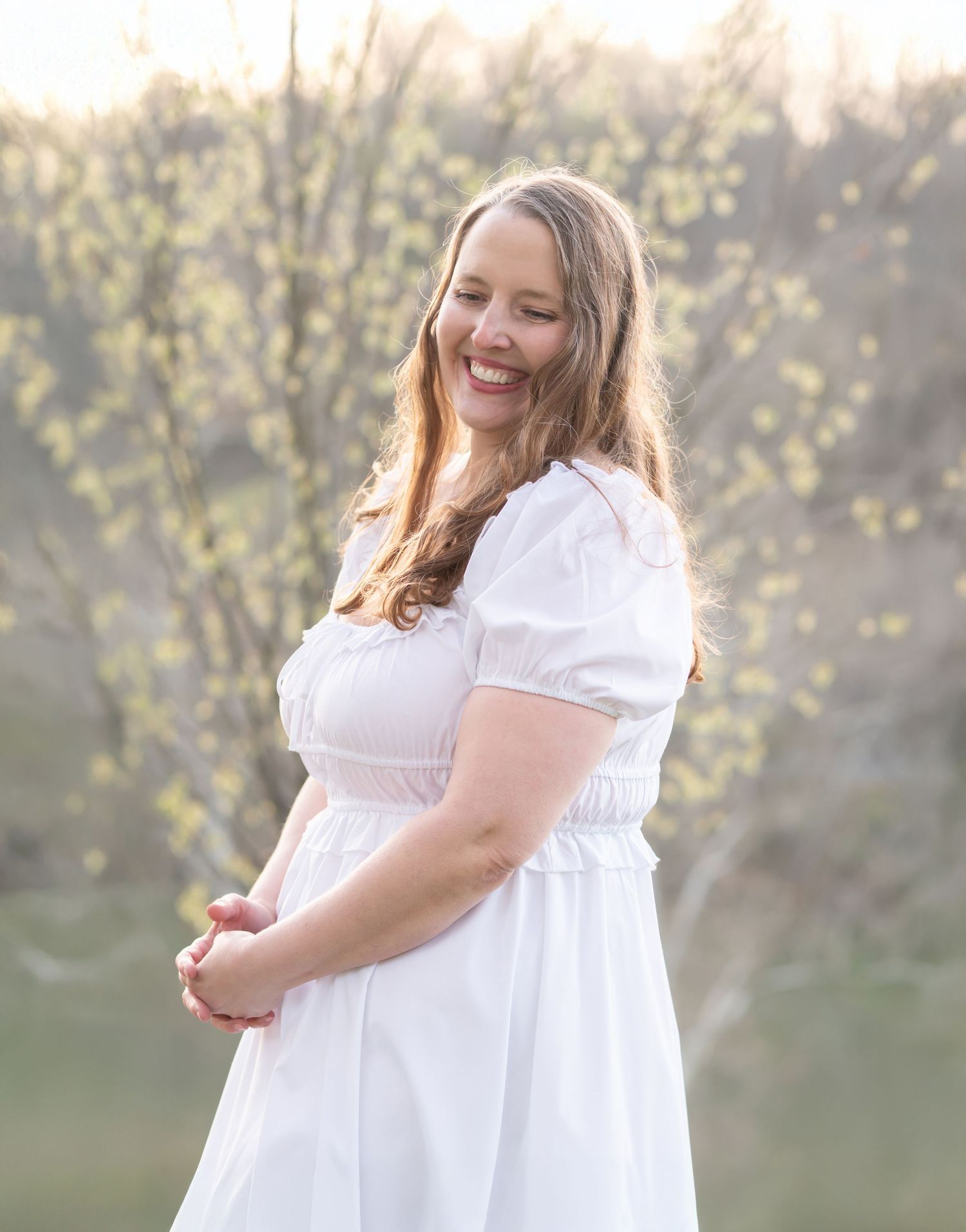
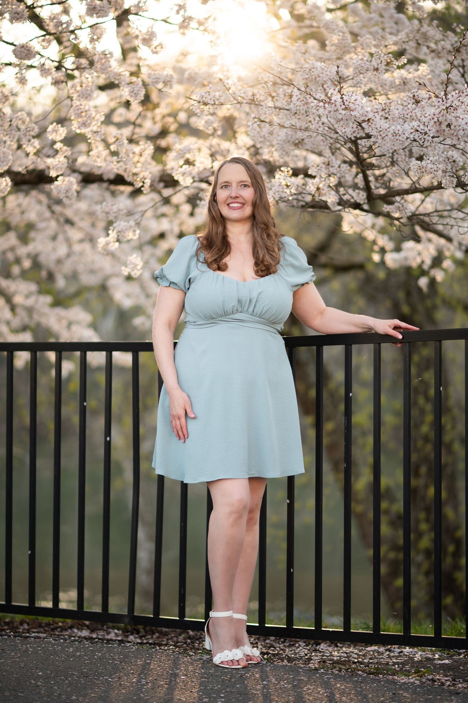
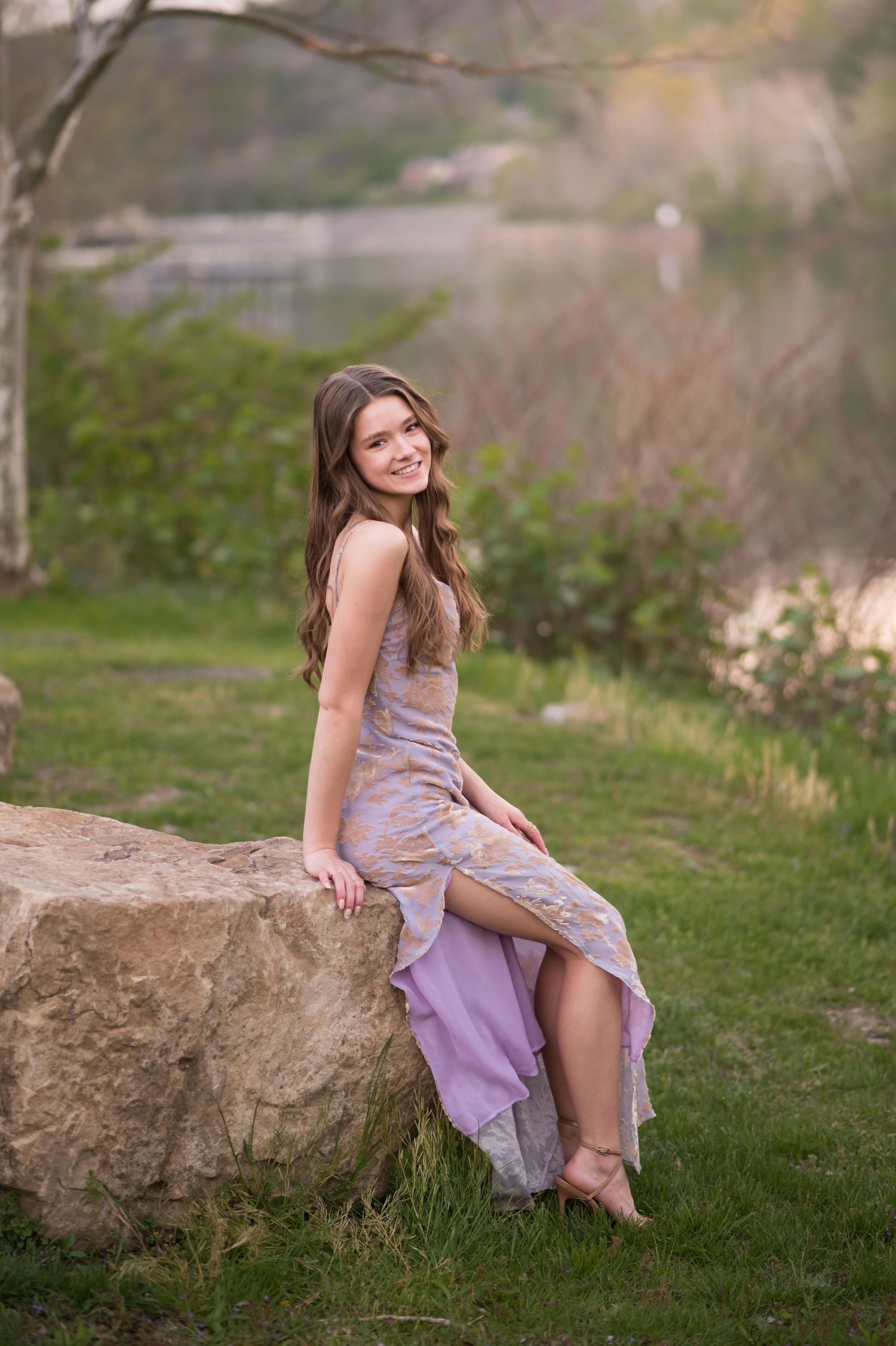
As the earth comes back to life in the spring, our outdoor settings fill with bright yellow-greens of new leaves, lemon yellows, whites and pale pinks of spring flowers, and light blue skies. Pastels, both soft and bright, look lovely during spring sessions. Pure white and cool shades of khaki and gray pair beautifully with nature's palette in the spring as well.
For individual sessions (such as a senior session or princess session) spring is the time to wear that neon pink or bright lemon yellow dress, with a backdrop that will complement it beautifully!
Looking for spring outfit inspiration for your family portraits? Click here to check out the Easter Edit 2026 on the blog!
Colors to avoid for spring sessions: Rich warm or "muddy" colors (burnt orange, red, mustard yellow, rich brown, etc.) tend to look more discordant against spring's soft cool hues here in WV. Save these rich warm colors for your fall session!
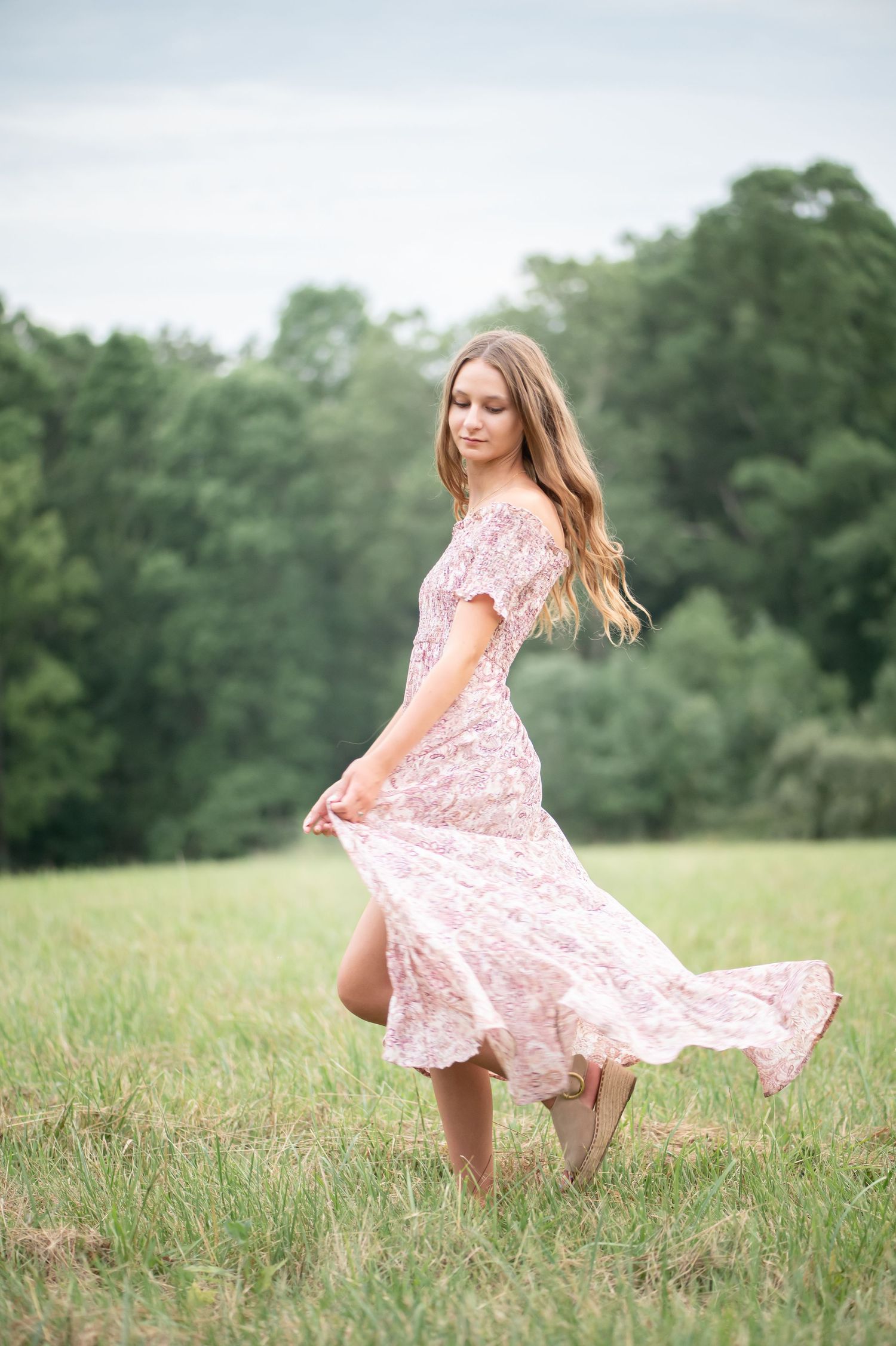
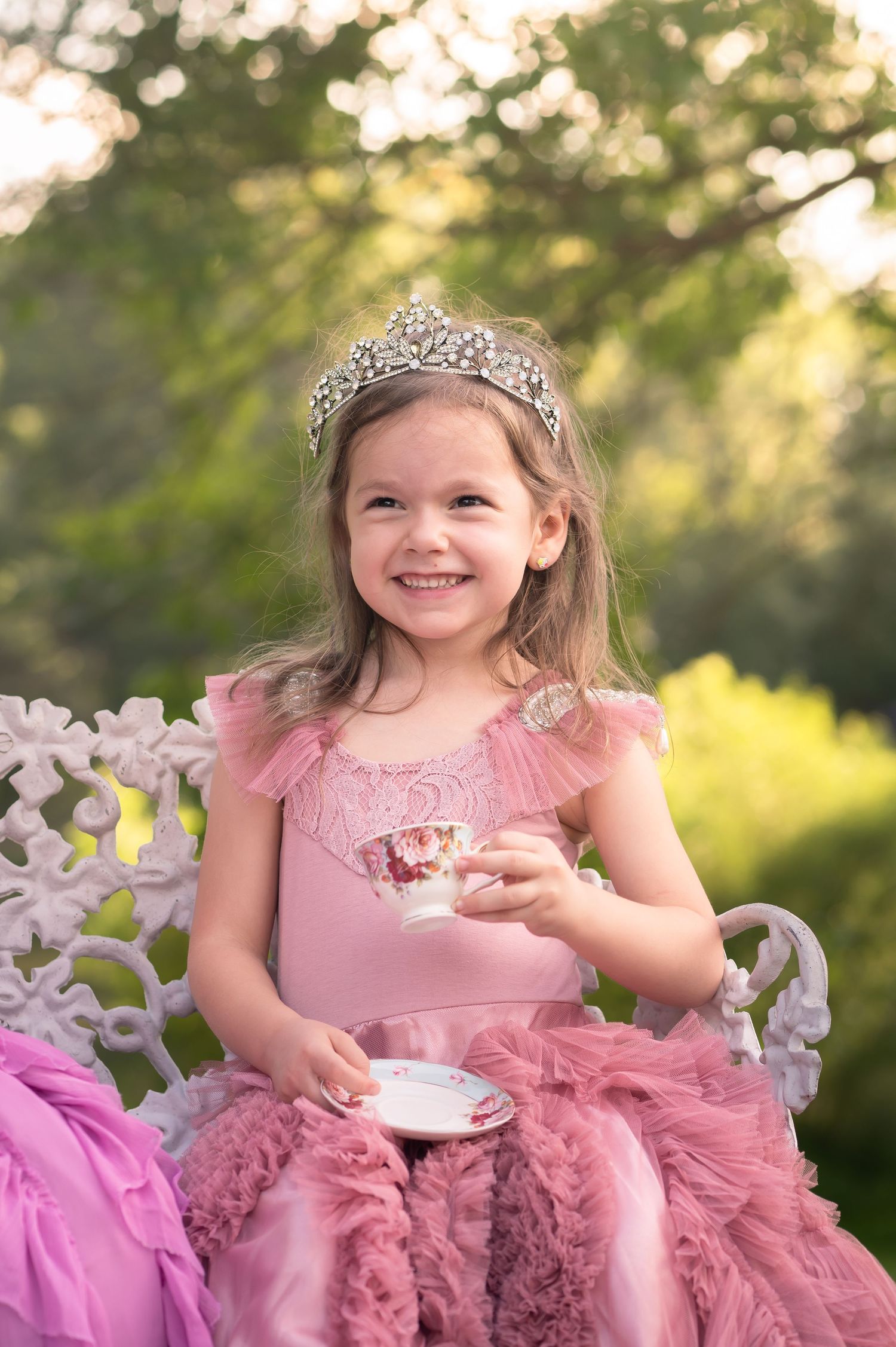
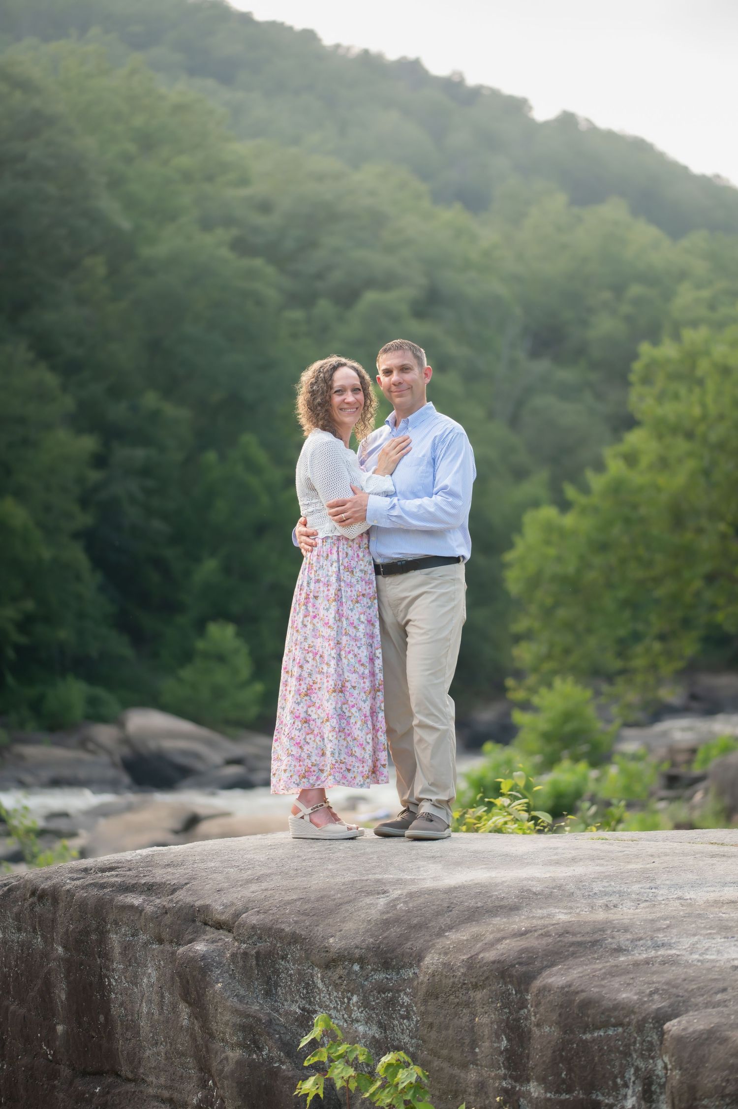
Summer in West Virginia, once trees and plants are in full leaf, means a backdrop of rich, bright greens and deep blue skies.
It is probably the season that allows for the most versatile clothing choices, since clean pastels, deep colors, muted neutrals and warm tones all look fantastic with West Virginia summer scenery in the background.
When coordinating a summer session wardrobe for a group, consider choosing one main color in various shades to mix with neutrals, or one cohesive palette in similar tones (pastels or jewel tones, for example.)
Colors to avoid: bright red and black tend to not blend well with the bright natural colors of summer scenery.
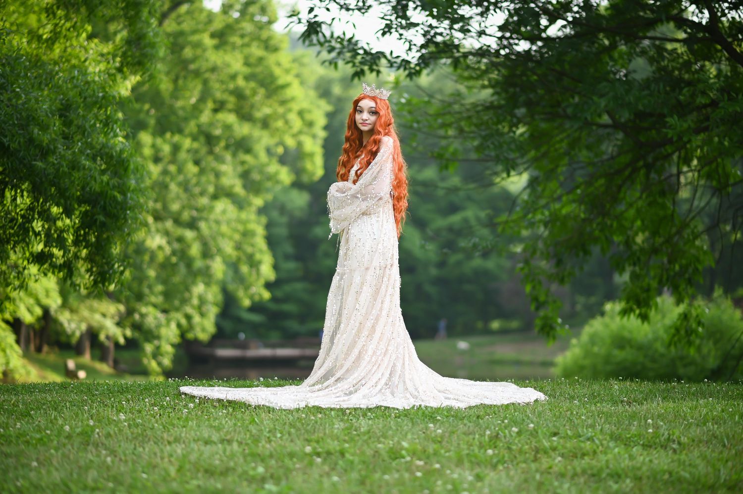

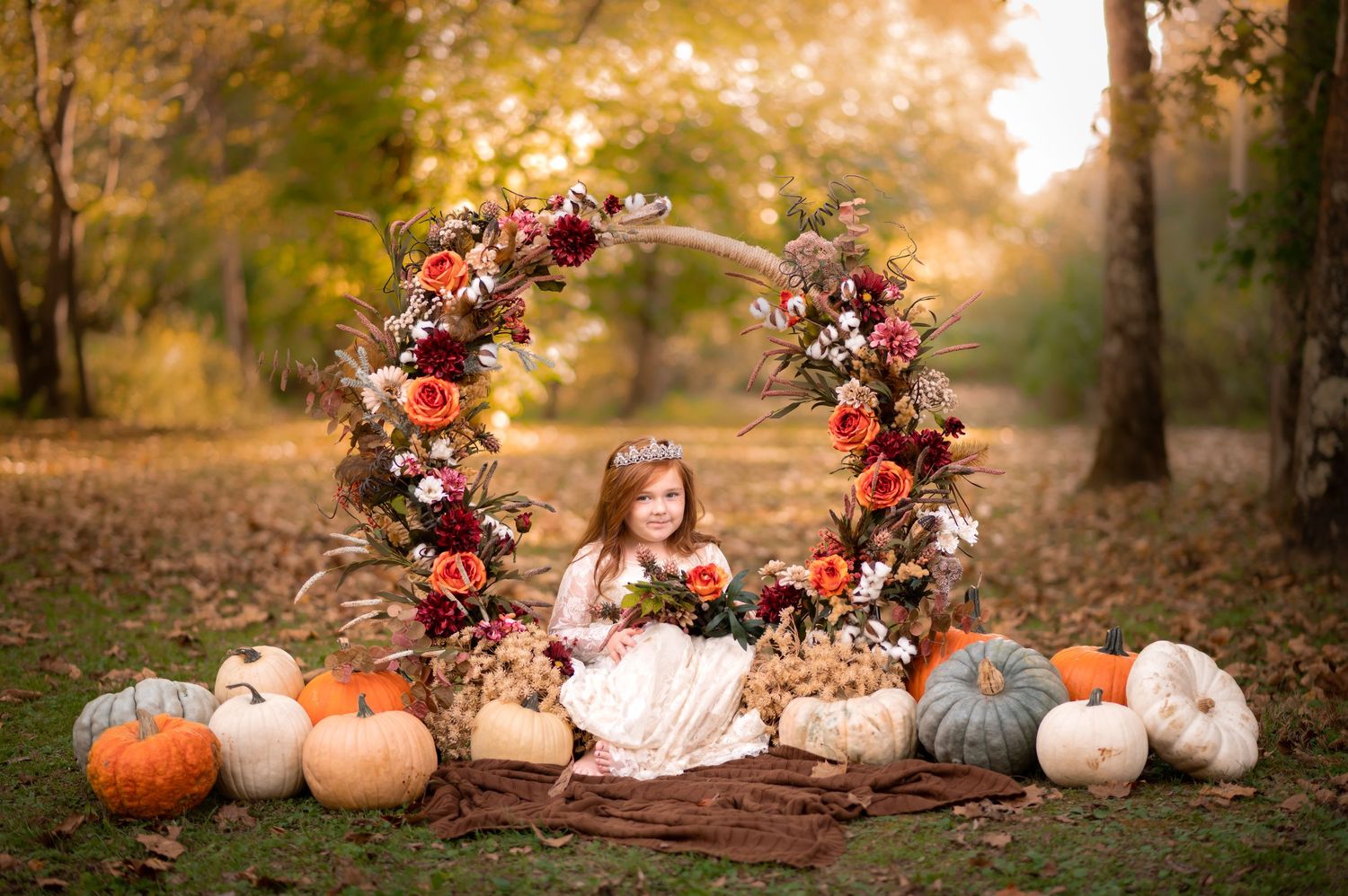
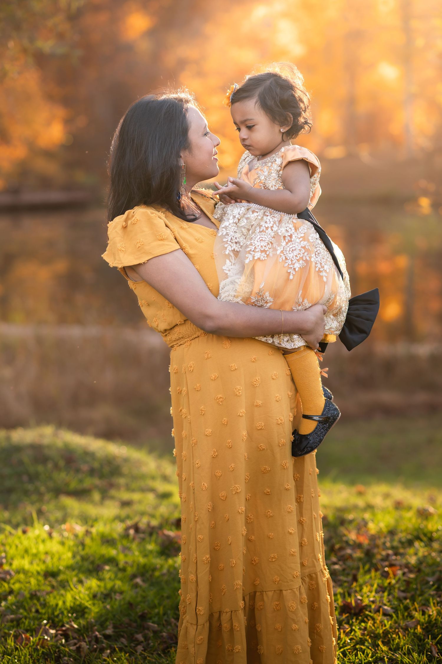
Beloved by clients, photographers, and tourists from all over the country, autumn in West Virginia is a glorious chorus of rich warm tones and golden light– and by far the most popular time of year for portrait sessions.
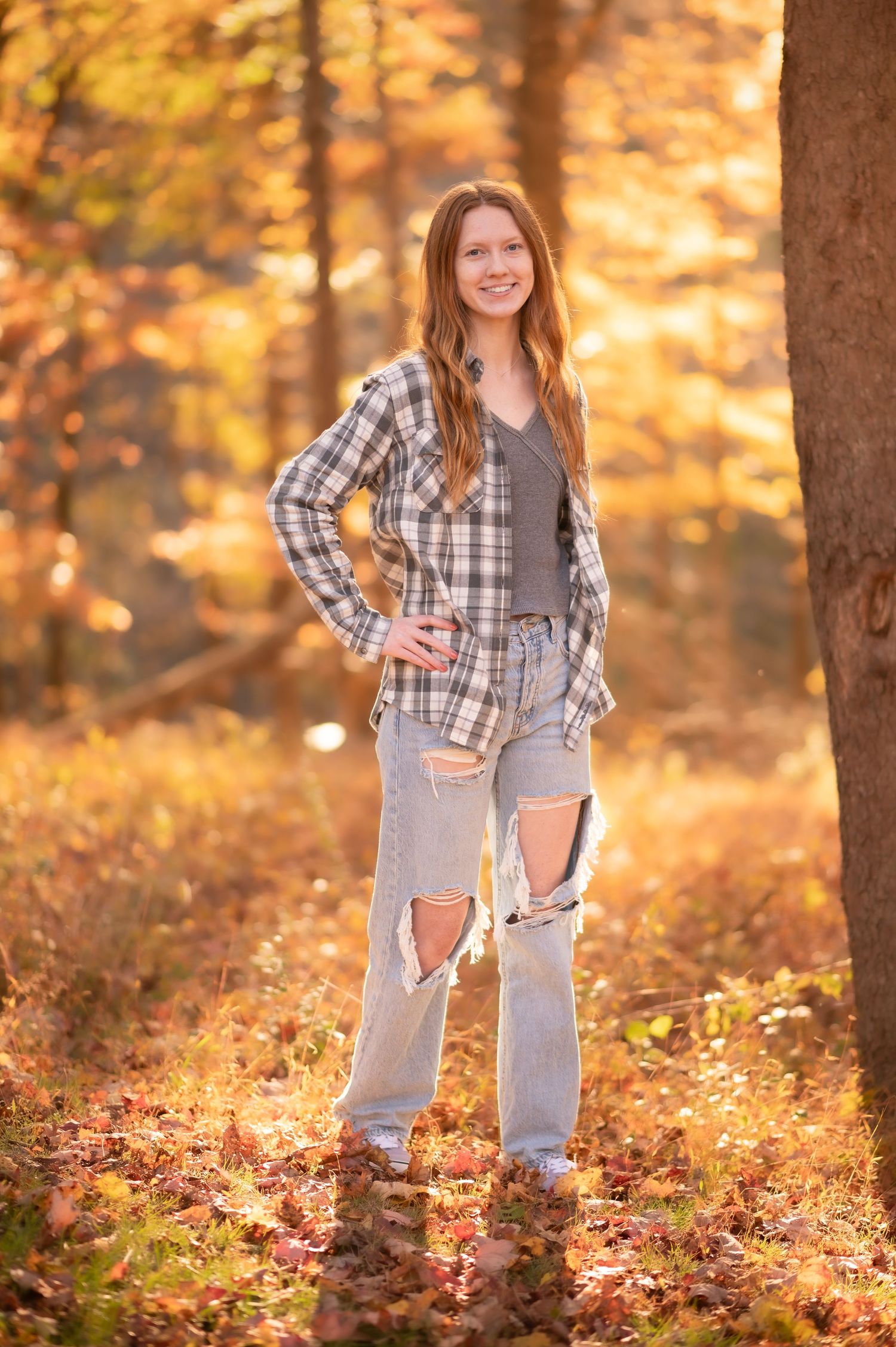
Soft ivory, mustard yellow, rust orange, brown, khaki and beige all look fantastic with West Virginia's stunning fall foliage as the backdrop, while denim blue, forest green and muted sage accent and contrast beautifully. Tone-on-tone is hard to beat for autumn images!
The chilly weather provides an opportunity to add beautiful layers and texture as well (think chunky knitted scarves, textured sweaters and cardigans.)
Colors to avoid for fall sessions: bright colors and clean pastels do not blend well with fall's rich warm tones– most of the time. Black and pure white tend to look too stark as well; usually, opt for charcoal gray and cream, ivory or beige instead.
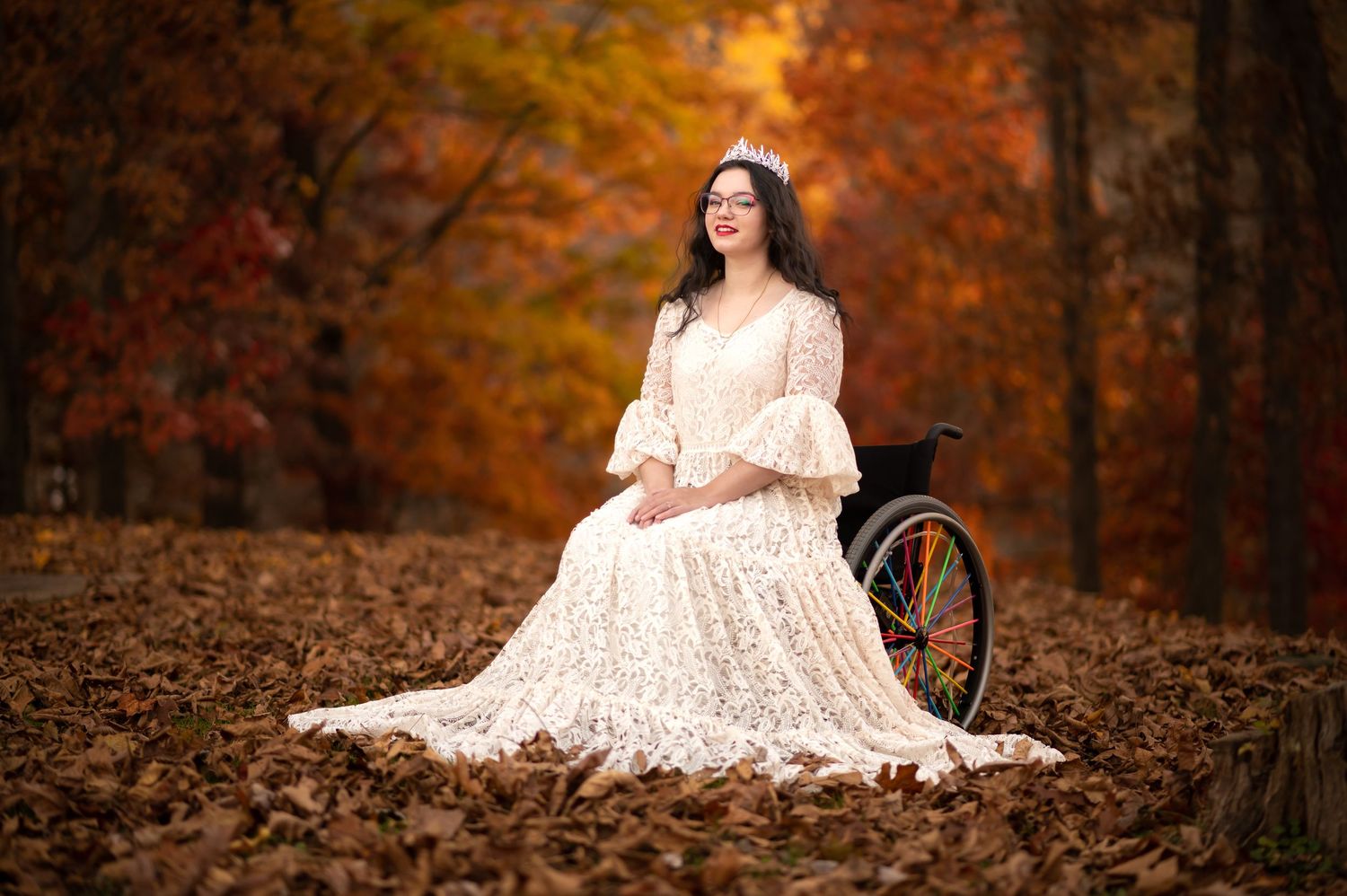
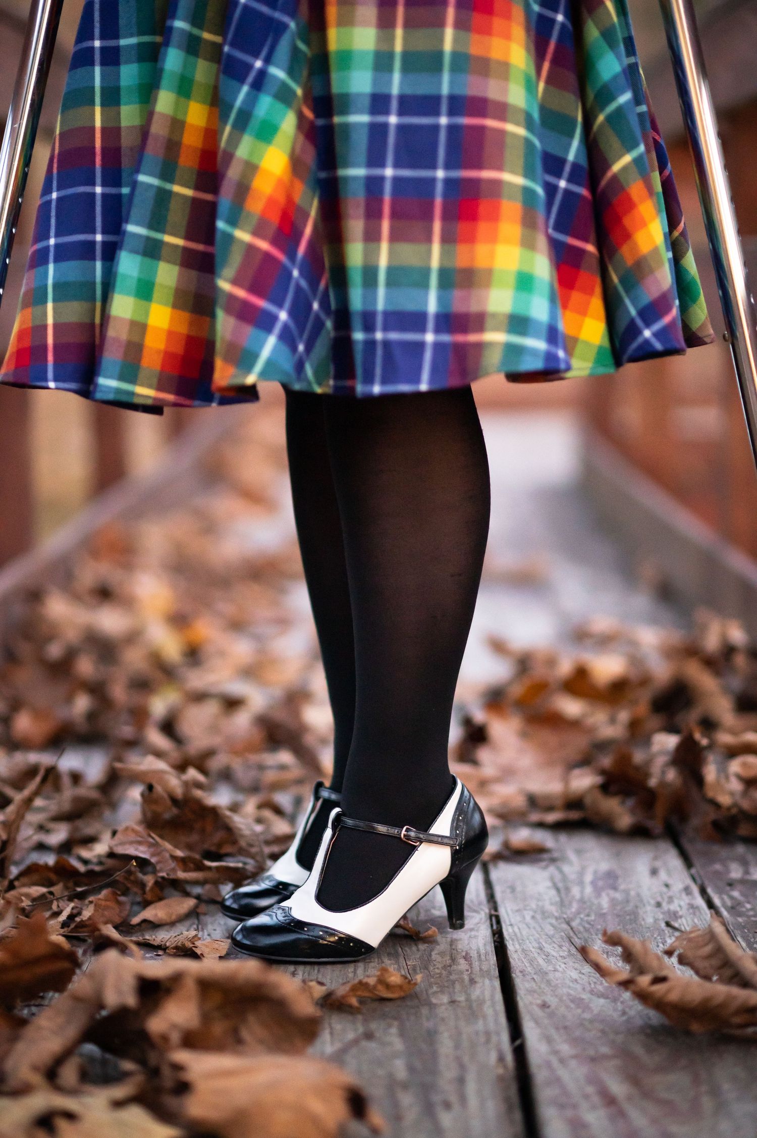
That being said, there are exceptions to every rule, particularly for individual sessions, as discussed below. I've included an image here, showing how black/white and bright tones were worked into a fall wardrobe session with gorgeous results. If you have a unique wardrobe idea in mind, let's chat about it and come up with a vision for it!
Tips for
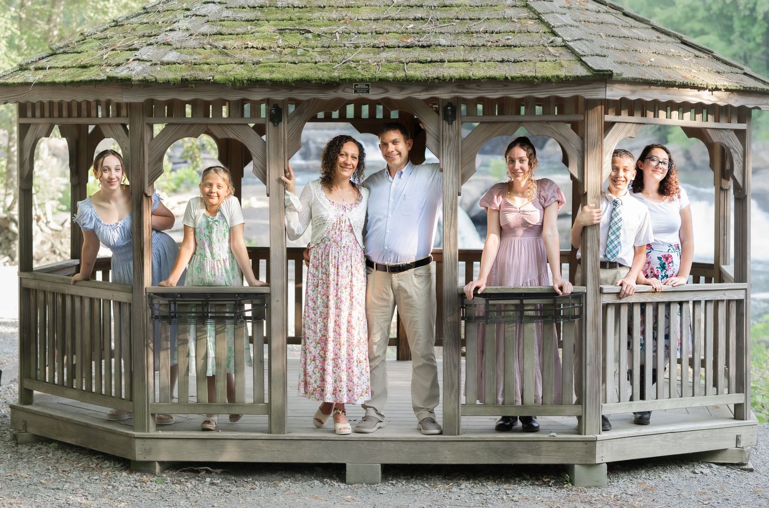
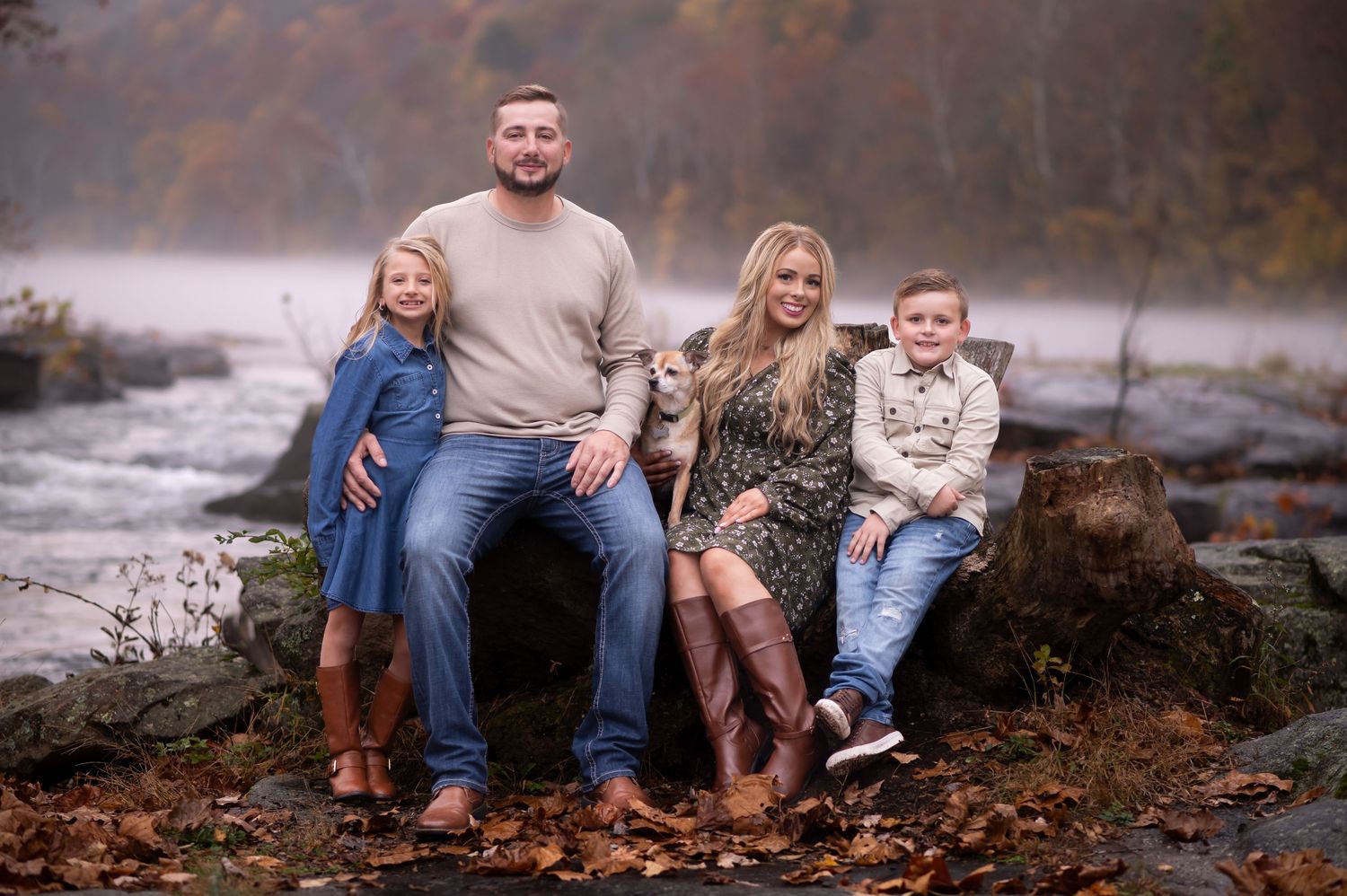
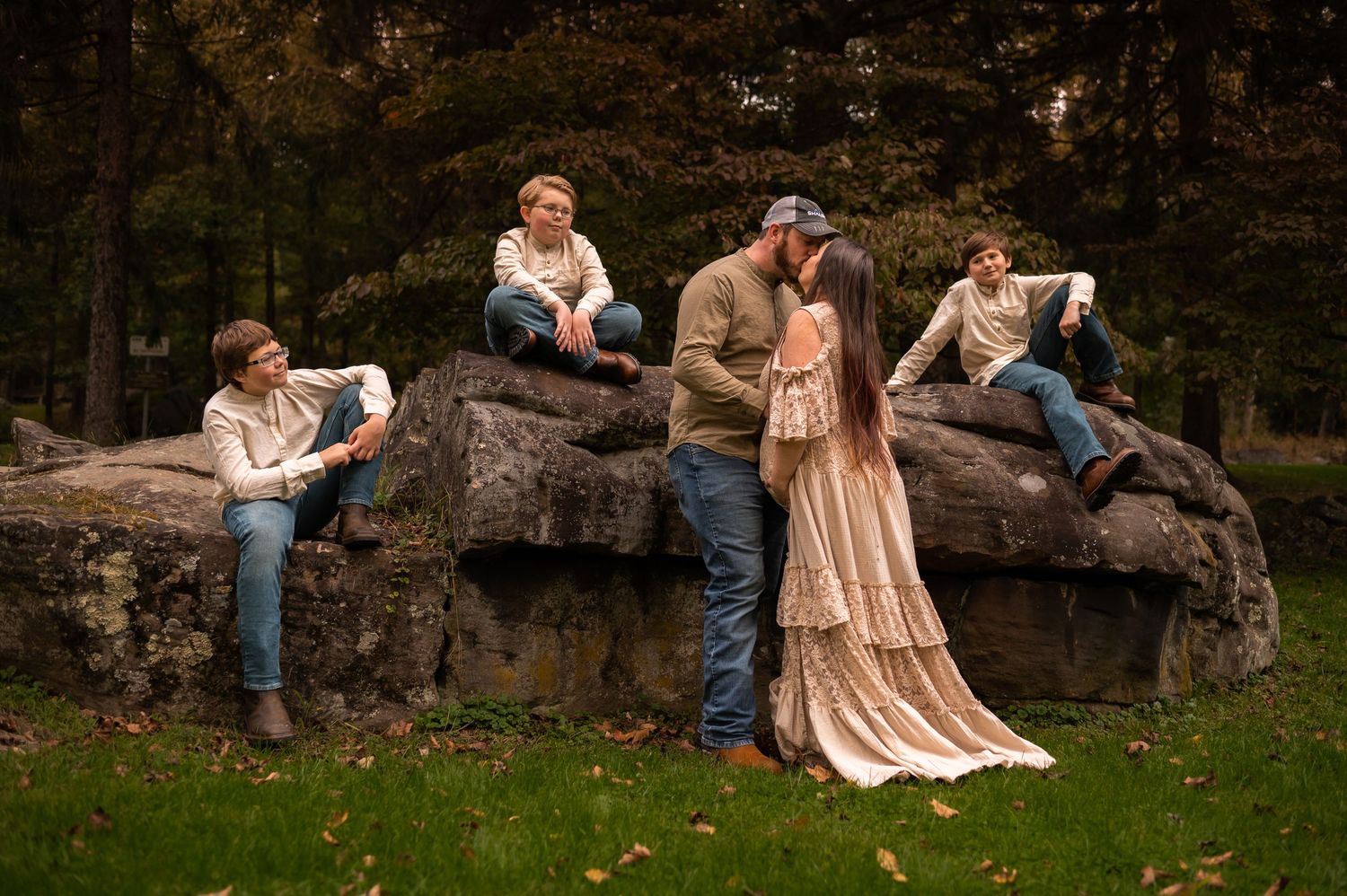
Group size is the final factor to consider. The larger the group, the more similarity in shade and tone will improve your final images, as illustrated in the family maternity portrait of my gorgeous client and her handsome men below.
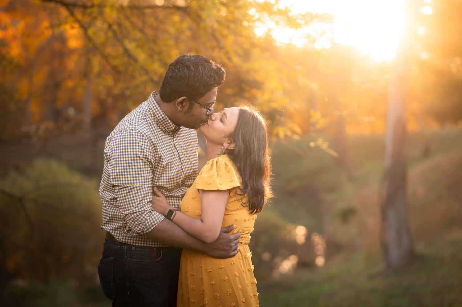
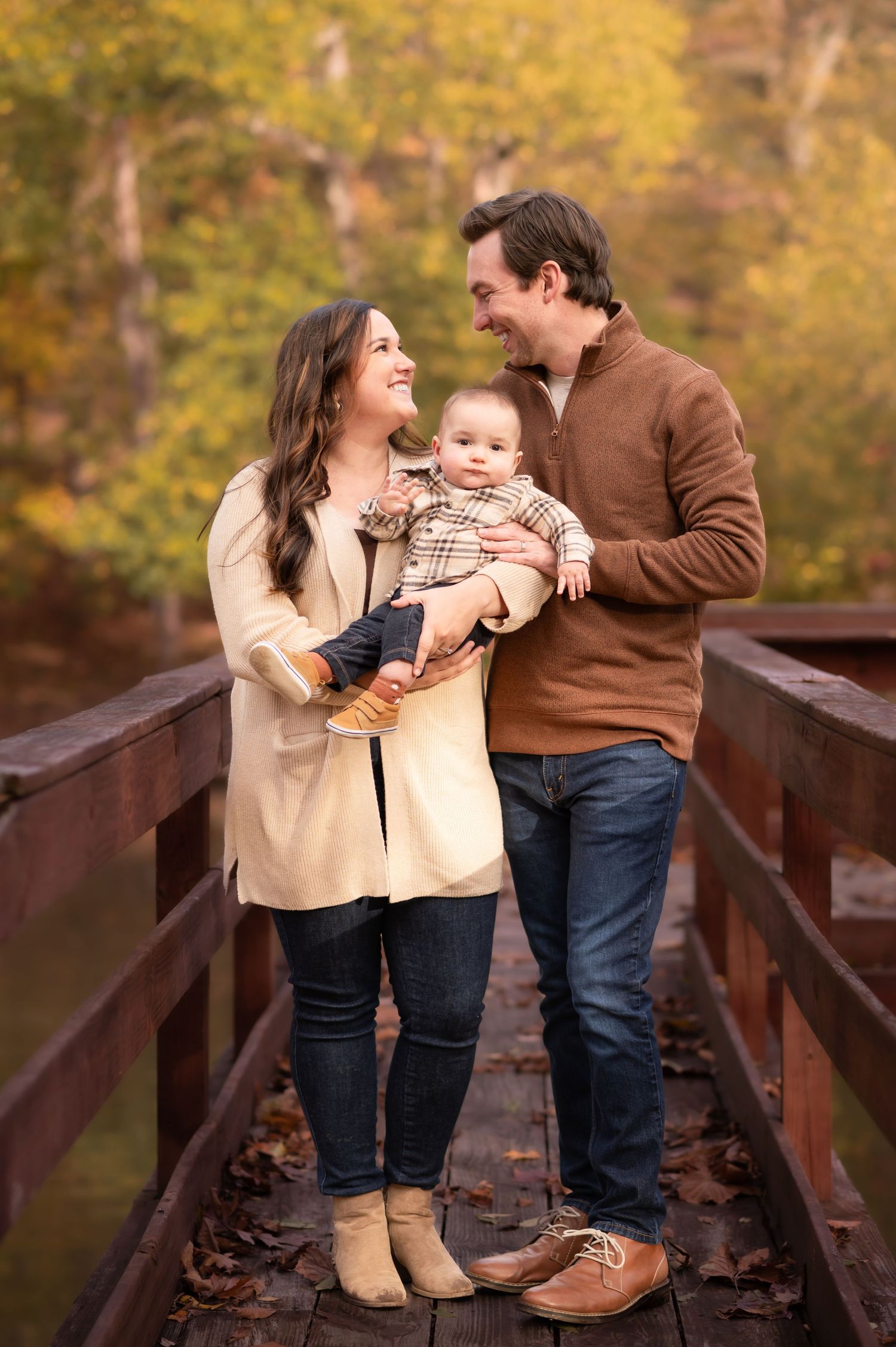
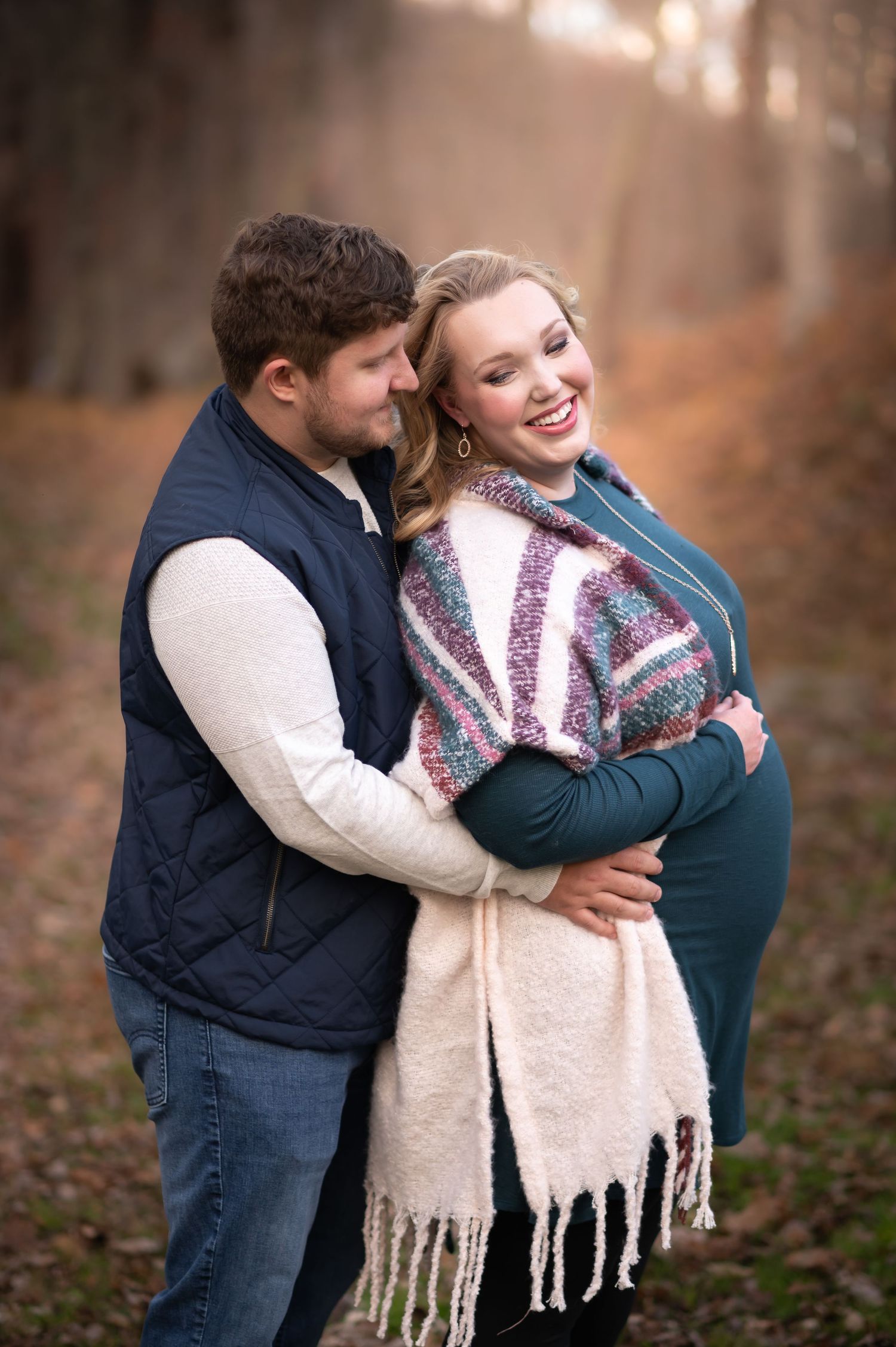
If you have a smaller group, adding some color variety, a pattern and/or some textures provides visual interest without making the image feel cluttered– as demonstrated by my beautiful maternity client couple and little family of three pictured here. Patterns and colors this bright could be overwhelming or distracting in a large group, but are perfect for these small groupings.
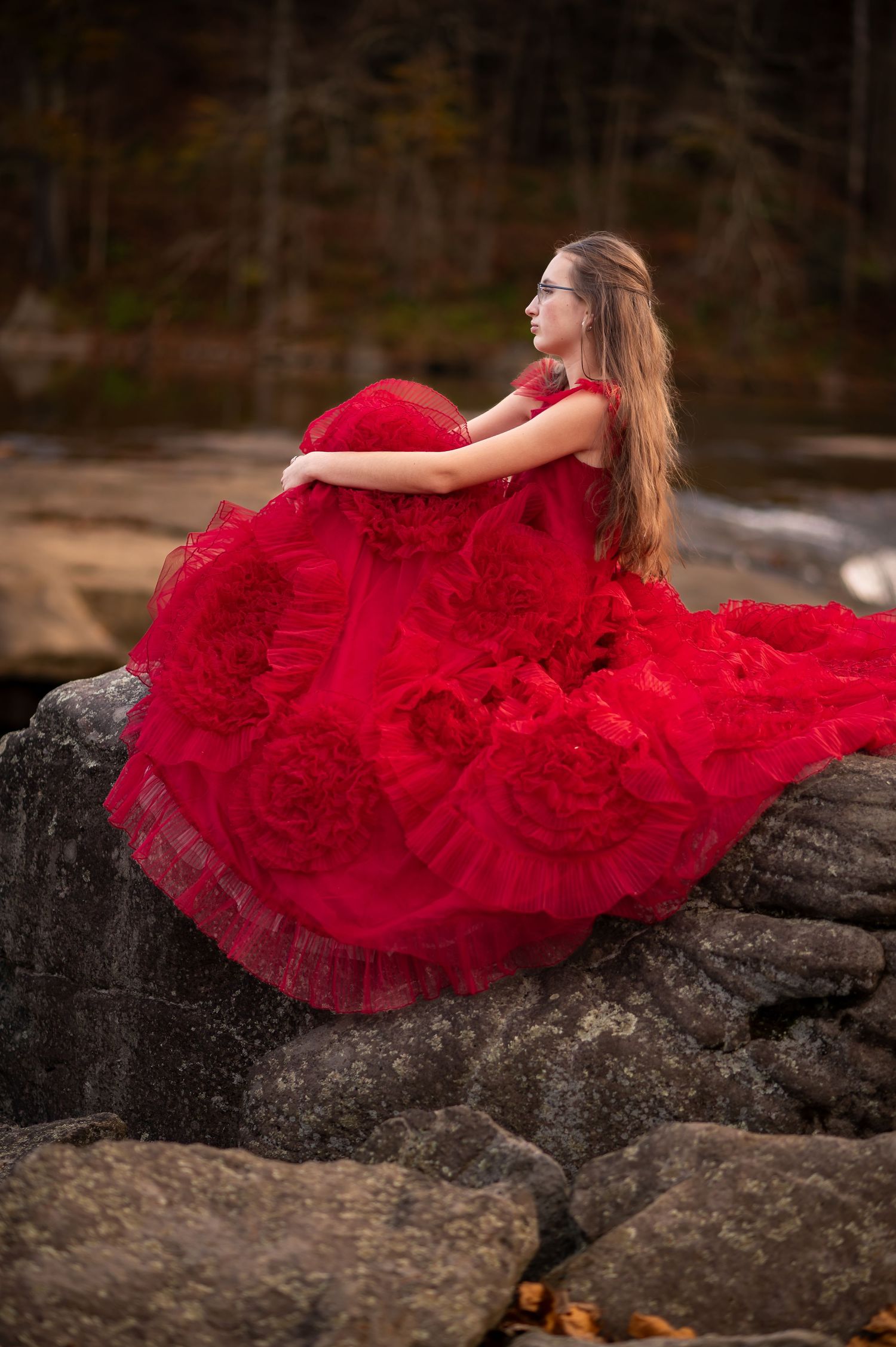
For individual sessions, there is much greater freedom of wardrobe choice. With all the focus on one person, brilliant and unusual colors and styles can take center stage, spotlighting the subject beautifully in a way that wouldn't work well for a larger group– as demonstrated by my lovely young client in the glorious red dress. Bright red is a color that typically doesn't work well in outdoor settings, *especially* with groups of multiple people; in sessions like this one though, that can handle a little drama, it was perfection!
still need to get booked?